CollegeHumor Brand Refresh 2016
The Challenge
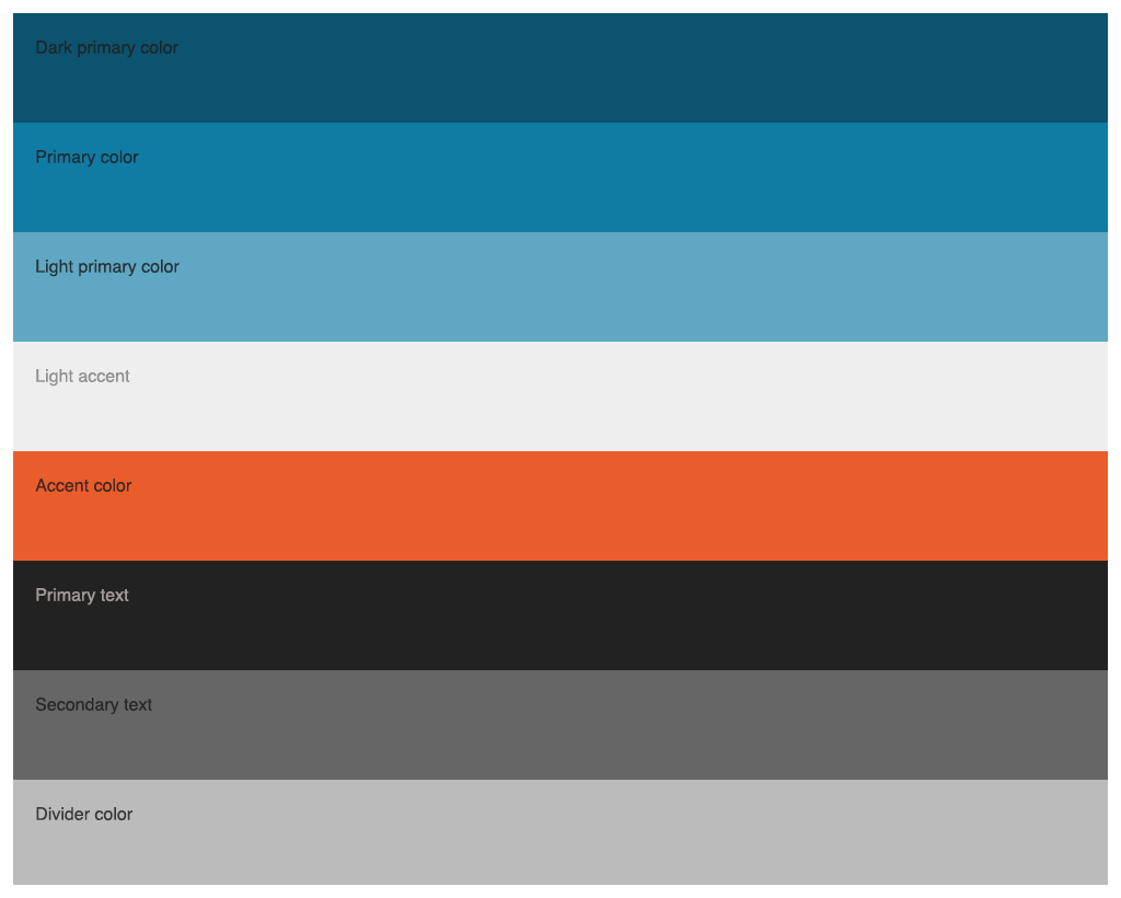
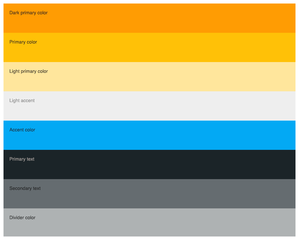
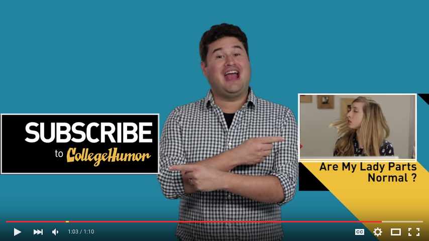
Motion ID’s, video titles, and the website design have fallen out of step. Still, all have some strong elements and relate to one another in some ways. The objective is to build upon the strengths of those relationships and steer each back to some core elements. The strengths of video titles include a flat, black-and-gold palette that resonates well with our young male audience. Strengths of our original video title cards include creative, whimsical typography in a contemporary palette. Strengths of the 2013 brand refresh include the CH long-shadow button and the introduction of a material design color palette.




The Solution:
Refresh and realign the CollegeHumor visual identity through new bumpers and new website colors.
Type
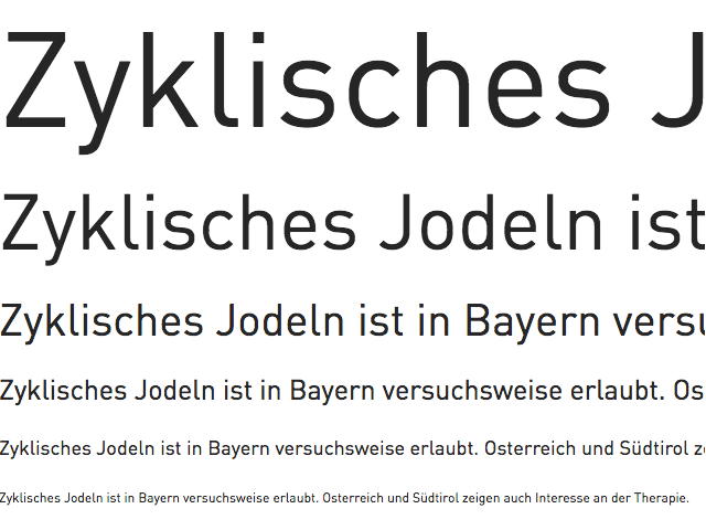
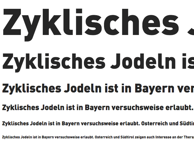
The DIN family is still a good fit for us. Making greater use of thin and heavy weights can lend freshness and legibility in appropriate situations.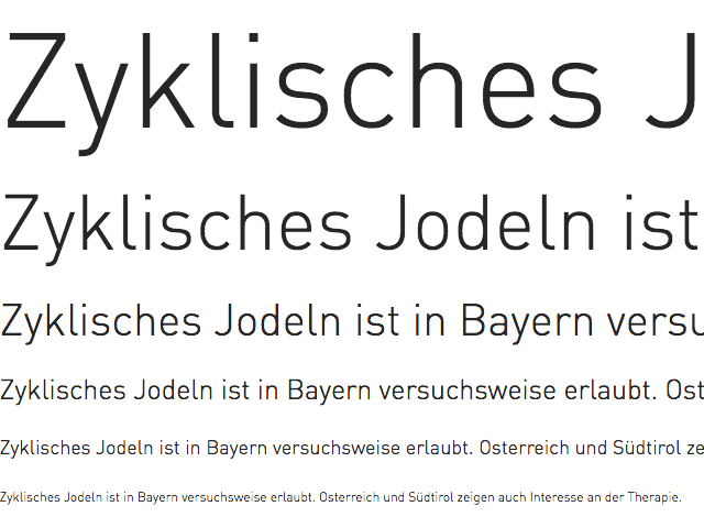
User Interface
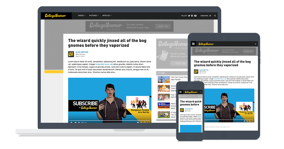
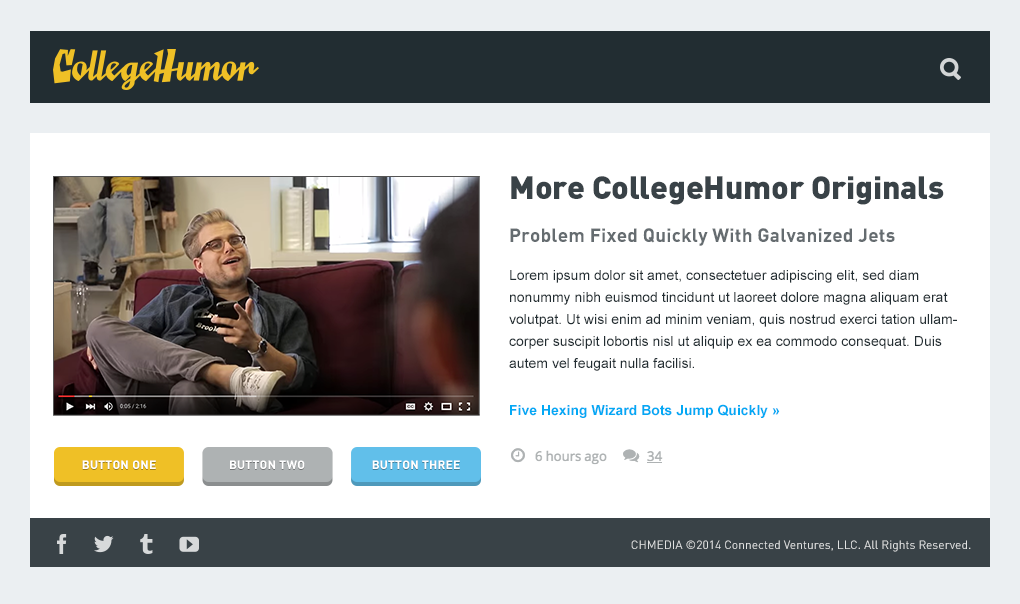
Without focusing too much on specific applications, the general user interface design is streamlined, flattened, and updated.
ID Bumper
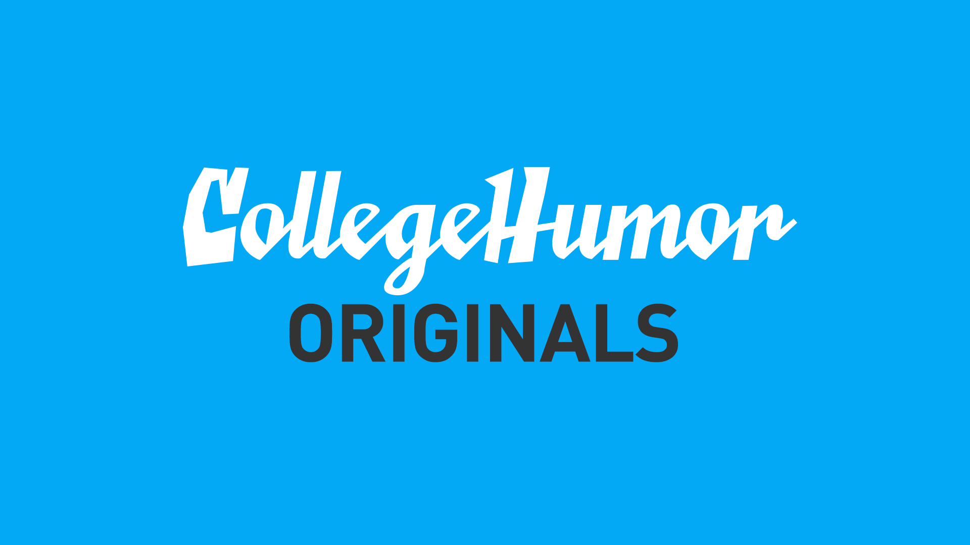
A fresh ID bumper creates a reference point for motion graphics artists to iterate on.
Extended Palette
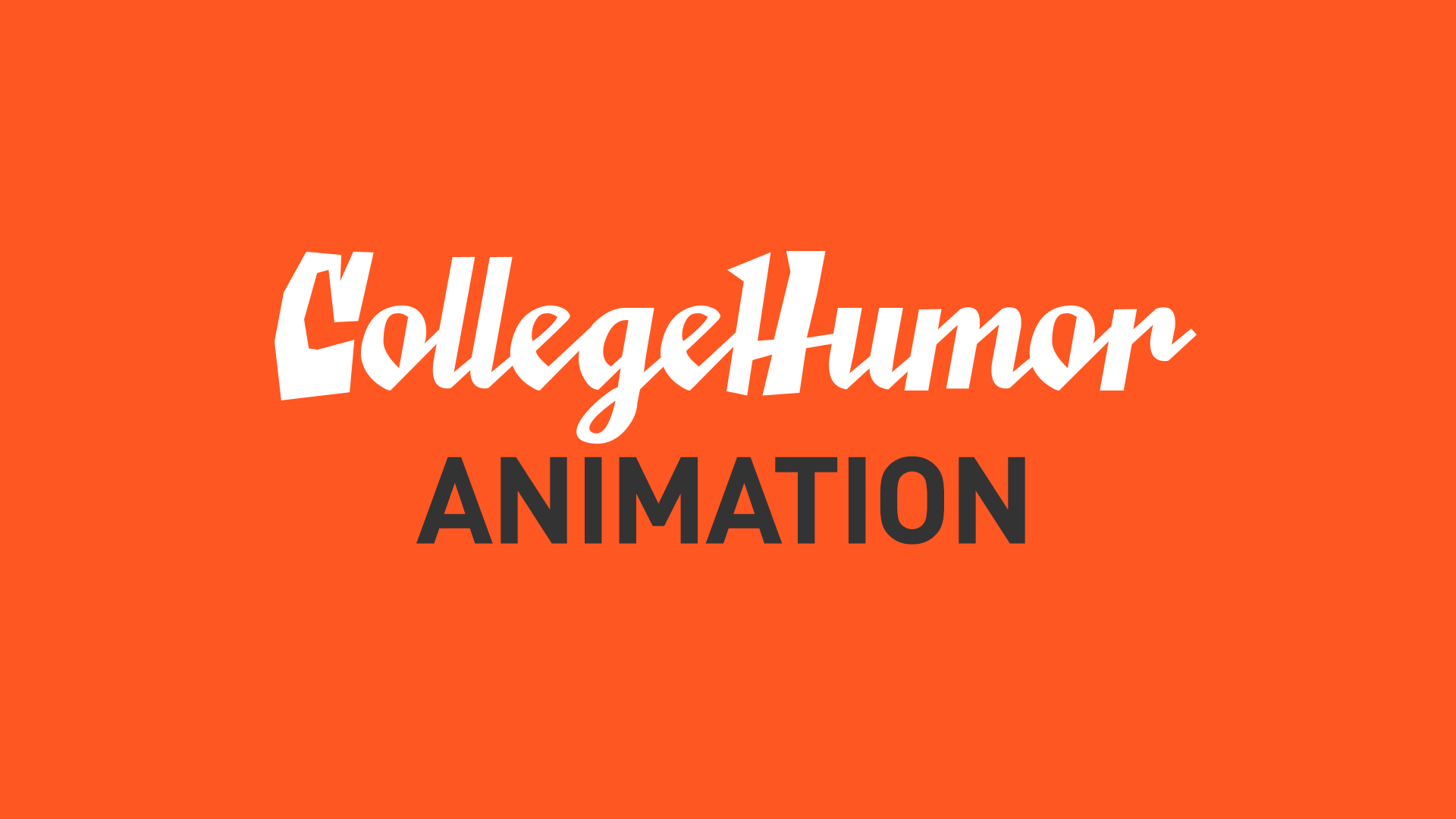
An extended palette is used to brand individual video franchises.


The Solution:
Refresh and realign the CollegeHumor visual identity.

